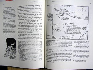
 Published D&D modules are typically laid out like dictionaries: dense columns of prescriptive rules, sorted by location instead of by word. They’d be more useful if they were designed more like annotated texts (text body in one column, commentary in the other). When there’s no spatial way to organize room descriptions, they become untidy with digressions, commentary, and rulings on potential player actions. The important and the unimportant, the obvious and the hidden are necessarily jumbled together.
Tomb of Horrors is famous for being a player-killer dungeon, but with its info-dump approach to tricks and puzzles, it’s a bit of a DM-killer too. Take the final confrontation with Acererak. It takes up a full two-column page, and you don’t get Acererak’s stats until the bottom of the second column, after a description of his treasure, an out-of-place history of the Tomb, and the details of every other trick in the room. Furthermore, this monolithic wall of text gives the false impression that everything in the description merits the same level of authority. As others have remarked before, many of the methods used to damage Acererak (a haphazard list of spells, certain magic swords, a thief slinging gemstones) feel like on-the-spot rulings during a playtest, encoded by the author into rules law. There’s no reason why clever players shouldn’t invent new attacks and add their own exploits to this list, which should be presented as a sort of Talmudic commentary to the module’s scripture that “Acererak is nearly invulnerable.”
What would an annotated adventure module look like?
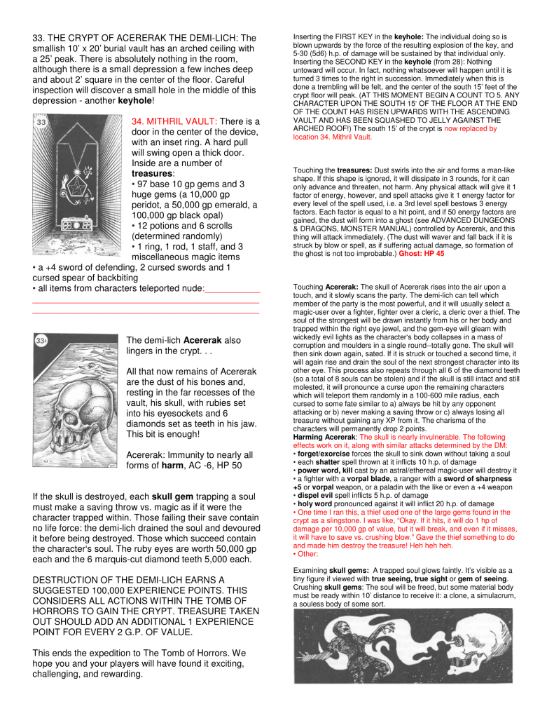
The main column would be primarily concerned with objects: the room and its description, its contents, its occupants, immediate traps, and other information that the DM needs up front. Objects in boldface would have annotations next to them.
Next to each boldfaced object would be its verbs: a non-exhaustive menu of things the players might do and what happens in response. Here is where we’d move all the minor but necessary mechanical details that clog up room descriptions: the tricks, traps, and secrets that players find by messing with stuff in the room. If a player touches Acererak’s skull, the DM doesn’t have to search the whole page; just find the bold-faced “Acererak” in the main column and scan its annotation.
Annotations can’t possibly be comprehensive and don’t even have to be authoritative. They might include traps and puzzle solutions, described in the standard impersonal rulesy voice, as well as conversational anecdotes about crazy things that happened in the author’s home game. After all, half of every adventure is written during play; the module author doesn’t need to obfuscate that fact.
As a proof of concept, I’ll try setting up the Acererak room as one annotated page. While I’m reformatting, I’d like to fix a few other things that bug me about D&D module layout:
Space for DM annotations. A D&D module isn’t a collector’s item to be preserved mint, and an adventure location isn’t static. PCs change every room they enter. The DM should have somewhere to record these state changes. For instance, there should always be space below a monster’s stat block to track HP. If the players befriend the monster instead of fighting it, the DM can use this space to record details of that alliance. (Chances of befriending Acererak are low, but never rule anything out.) Furthermore, many DMs don’t run modules as written. They make lots of notes before ever running the adventure. A densely printed page doesn’t leave a lot of room for this kind of marginalia. An annotated module, with uneven amounts of text in the right and left column, will probably have lots of white space. That’s a plus.
In the case of Acererak’s vault, we’re going to have very little room for DM notes, because the original layout is already a full page with no white space or margins to speak of. But we should be able to carve out some room to track Acererak’s and his pet ghost’s HP. Furthermore, the vault’s treasure includes a potentially large amount of gear stolen from players in various teleportation traps. We have to add a place for the DM to list this gear.
Artwork. Tomb of Horrors has many pages of player handouts, two of which are referred to on this page. The reference to any player handout should include a thumbnail for the benefit of the DM.
Here’s my version of Acererak’s Vault, with significant text changes in red.




I really like your idea here of annotated adventures. I would suggest using room numbers on the annotated side just to make them easier to reference. So room 33 on the left would have 33 on the right for each notation related to that area.
Ditto, Rachael. This format would be extremely helpful going forth. It’s too late for those of us who already died a zillion times in Tomb of Horrors (to continue the comparison) since we’ve unconsciously memorized the joint, but it would make a big difference for future GMs and players.
PS: Vote for Dungeon Robber for Android.
This is really cool. I have been creating “transmissions” for the game I run, based on how adventures were written in the indie tabletop game Technoir. It’s another framework approach to adventure running. The game actually builds actions through verbs, nouns, and adjectives, which fit in pretty nicely to what you are suggesting above. I like that approach a great deal.
If you are interested in the approach, you can check it out here: http://www.tribality.com/2016/05/25/adventure-creation-lessons-from-technoir/
I definitely like what you are doing here.
This is a great idea! Very user friendly.
There are some GURPS books that use a similar format, though not quite this well laid out. I’ve long wanted to use LaTeX and academic style footnotes for writing adventures and RPGs. Have the trap in the body text, then the rules in a footnote. Caption rules explaining why you wrote them the way you did, so that DMs can actually see the intent of the rule when making rulings, and so on.
I really like the reformatting–it seems to work so much better. If you have a chance, maybe you should check out Maze of the Blue Medusa for how they formatted their adventure since they use an annotated/abbreviated summary page for each section of the mega-dungeon and then a descriptive page following (after the random-encounter table was reprinted).
Cheers to functional design actually getting into more products!